
Tarot Color Symbolism Explained for Richer Interpretations
Color in Tarot is not decorative only; it is a deliberate layer of meaning that interacts with archetype, posture, objects, and position. This article teaches a practical method for noticing and interpreting color in the Rider–Waite–Smith images, anchored to three supplied cards: The High Priestess, The Empress, and The Sun. You will learn how dominant hues, accents, contrasts, and saturation modify upright and reversed meanings, how to avoid common errors, and how to include color as an active piece of your reading process. The goal is richer, evidence-based interpretations that remain grounded in each card's conventional symbolism.
Cards explored in this article
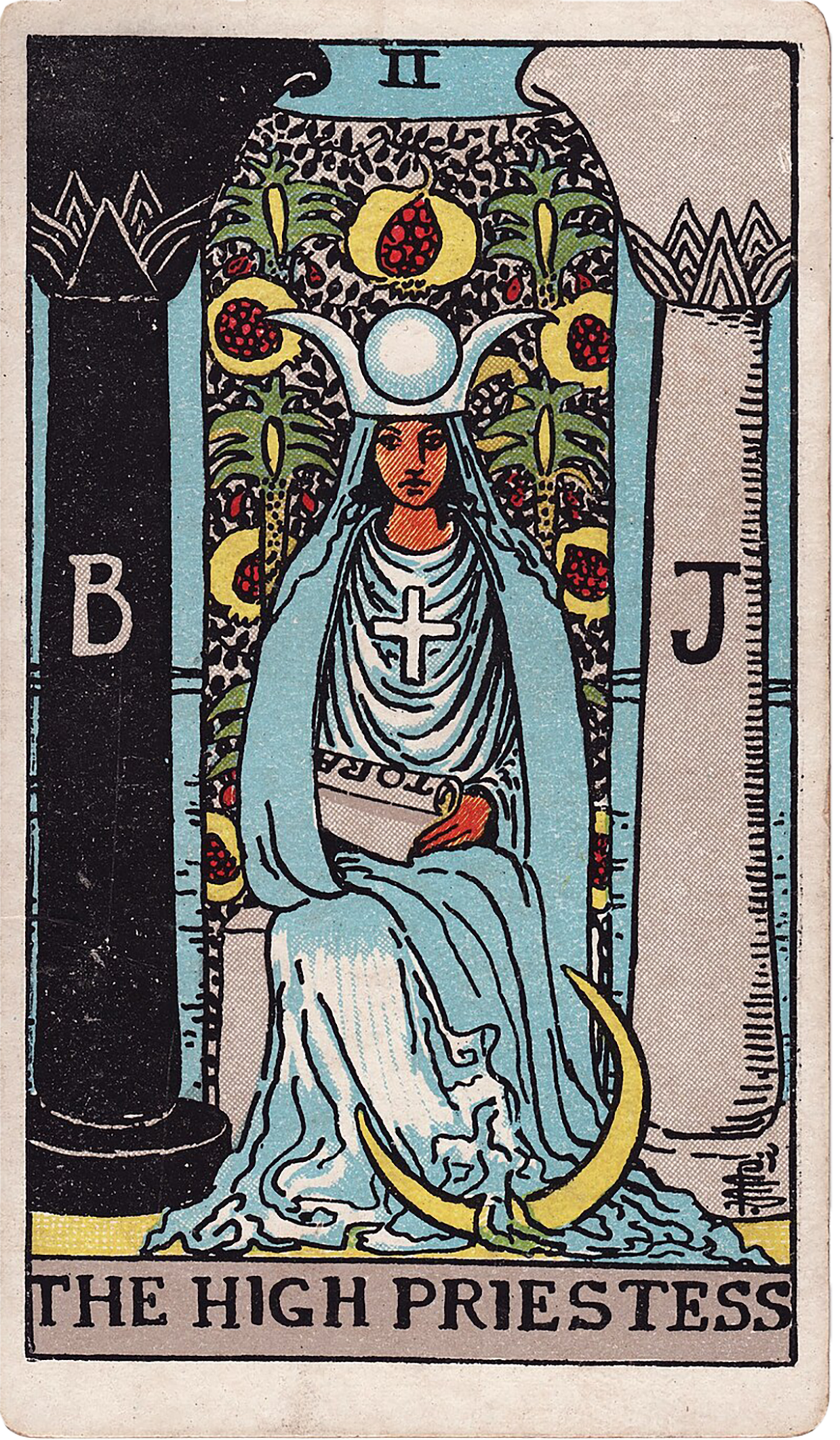 The High Priestess
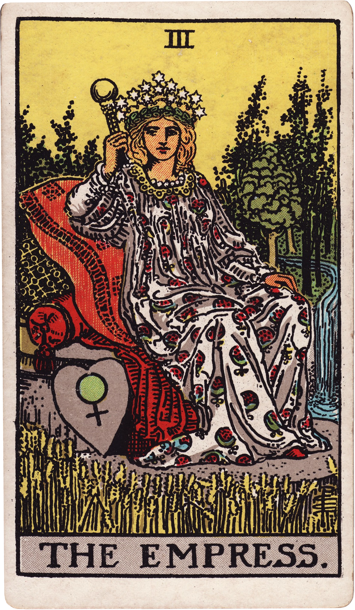 The Empress
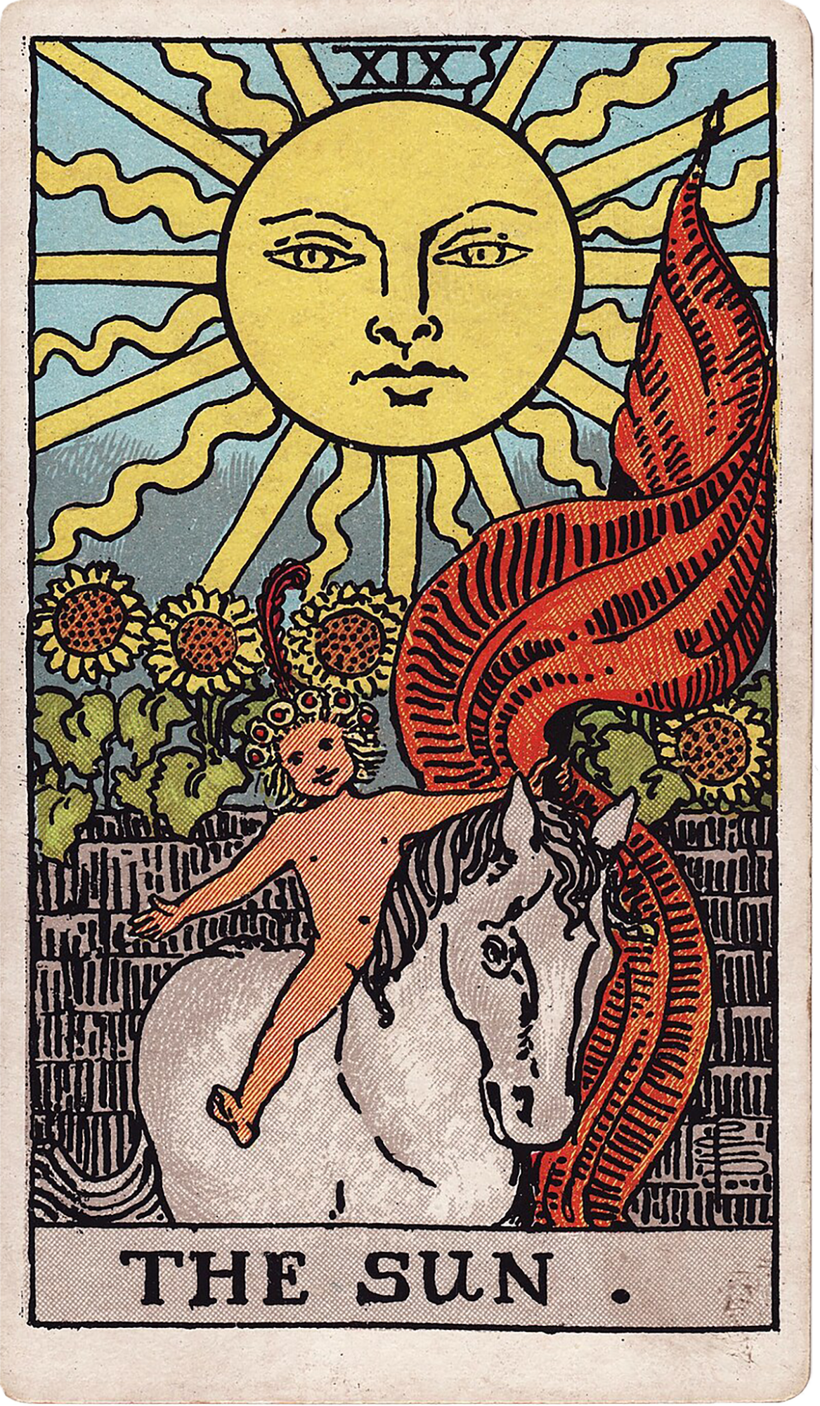 The Sun
Why color matters in Tarot
Color is an encoded layer of meaning in illustrated Tarot decks like the Rider–Waite–Smith. Artists choose palette, saturation, and contrast to draw attention, set mood, and support narrative. In practice, color affects how you experience a card at first glance: it helps orient attention, suggests emotional tone, and can signal developmental dynamics (growth, stasis, imbalance). Treat color as part of the card’s language — neither the whole story nor irrelevant decoration — and it will reliably extend your interpretations. Throughout this article we use three supplied cards (The High Priestess, The Empress, The Sun) to demonstrate how color and conventional symbolism work together.
Basic vocabulary and principles
Before we analyze images, establish a small working vocabulary: dominant color — the hue that takes up the most visual space or draws the eye first; secondary colors — supporting hues that shape context; accents — small but intense colors that direct interpretation (for example the red pomegranates on The High Priestess); saturation — how vivid or muted the hues are; contrast — difference between light and dark, warm and cool; focal color — the hue around or on the central figure which often carries the archetypal message. Use these terms as mental shorthand while you read. Principles to keep in mind: colors have both archetypal and culturally specific meanings (blue = intuition, calm in many Western contexts; green = nature, fertility; yellow/gold = clarity, consciousness), but always anchor color meanings to the card’s iconography and position in the spread. Contrast modifies meaning: a calm blue next to an angry red makes the blue defensive or reactive rather than purely peaceful. Saturation communicates urgency: high saturation demands attention; low saturation suggests dormancy or interiority. Inverted or muddied colors often signal blockage, distortion, or a reversal of the upright quality — useful when a card appears reversed.
Reading color on The High Priestess
Look first at the dominant palette. The High Priestess (Rider–Waite–Smith) is composed largely of cool tones: blues, silver/grey moon imagery, and the neutral black-and-white pillars. Note the following features and what they add to conventional meanings: - Blue robe: Blue suggests interiority, calm, receptive knowing, and depth — exactly the territory of The High Priestess’ upright meaning: listening beneath surface appearances and trusting quiet discernment. The robe’s blue encourages a reading that privileges inner listening rather than action. - Silver crescents and moon imagery: Silver/white tones emphasize the lunar, reflective, and receptive quality. In upright readings these colors reinforce the card’s message about holding back until information emerges. In reversed readings, that same silver can feel cold or shut off, suggesting disconnection from intuition. - Black/white pillars (B and J): The stark contrast is a visual binary — seen vs hidden, manifest vs latent — and frames the priestess between opposites. The black/white dichotomy invites you to ask where oppositions are unresolved in the querent’s life. If the rest of the image is muted, the pillars can appear more commanding and rigid, suggesting fixed boundaries or secret-keeping. - Red pomegranates on the veil: Red is a tiny but intense accent. Pomegranates are symbols of fertility and hidden life; the red accent warns that beneath calm receptivity there is potent, even erotic or generative energy. In upright position this says usable potential is available; in reversal the red can indicate suppressed desire, secrecy, or projection (mistaking anxiety for inner knowing). Technique for The High Priestess: note whether blue dominates or competes with any warm accents. Dominant coolness with small warm accents suggests a situation that is mostly inward and reflective but contains actionable energy if handled with discretion. If the coolness is dulled or the red is muddied in a reversed card, expect secrecy, blocked intuition, or projections interfering with clarity. Always pair color notes with the card’s practical guidance: asking where a clearer boundary or deliberately chosen action could move the situation forward.
Reading color on The Empress
The Empress is a rich study in earth tones and lush color designed to convey fertility, abundance, and creative power. Key color elements to attend to: - Green landscape: Green is the signal color of growth, fertility, and material abundance. A sovereign green field suggests conditions that support development — a core part of the Empress’ upright meaning about creating conditions for projects and relationships to grow. - Red robe and/or floral accents: The Empress wears red elements that communicate vitality, life force, and passionate creativity. Red balanced with green reads as generative; it is the tension of desire and nurture that produces fruit. - Gold/yellow crown and wheat: Gold or yellow accents (crown of stars, wheat in the foreground) point to flourishing results and the relationship between inner creative principle and manifest outcome. Yellow ties to practical cultivation and the ability to receive the fruits of care. - White gown or highlights: White introduces purity, protection, and the ethical quality of care. It reminds us that generosity without boundaries can lead to smothering — a frequent reversed meaning. Technique for The Empress: measure whether green feels expansive and vivid or choked and faded. In upright readings, vibrant greens and golds reinforce the card’s instruction to work consistently with what is available now. In reversal, greens that look pale or brownish suggest overgiving, creative stagnation, or neglect of self-care. A red that dominates without green can warn of overinvestment of energy without sustainable structure. Always ask: where would clearer boundaries, more deliberate choices, or better self-care change the pattern?
Reading color on The Sun
The Sun’s palette is unapologetically warm: intense yellow and gold with red accents and the bright white of the child and horse. Colors here function to emphasize clarity, success, and celebration. - Dominant yellow/gold sun: Yellow denotes clarity, optimism, and consciousness. The brightness of The Sun image is literalized as clarity and progress. In upright readings this affirms acting with confident openness; in reversed readings a slightly dimmer yellow can signal temporary clouding of joy or burnout behind a cheerful surface. - Red banner and sunflowers: Red here is celebratory and passionate; paired with yellow it intensifies vitality and life force. Sunflowers oriented toward the sun add the idea of orientation — attention turned toward light and growth. - White horse and child skin tones: White suggests innocence, truth, and simplicity. The presence of white in the central figures underscores the openness and receptivity that allows success to be enjoyed. Technique for The Sun: ask whether the yellows are vibrant or slightly muted. Vibrant golds and clear contrasts support interpretations of effective action and visible progress. Muted or muddy yellows — or an over-saturated red without balancing white — indicate either overconfidence or a fatigue that prevents full receptivity to success. Tie color reading to the card’s practical advice: identify where direct response and clearer boundaries would enhance the present success.
Putting color into a reading: step-by-step method
Use this practical checklist when a card appears in a spread. Apply it to each of the supplied cards in turn. 1. Observe without immediate judgment: name the dominant, secondary, and accent colors. Example: The High Priestess — dominant blue, secondary silver/grey, accent red pomegranates. 2. Locate the focal color: which hue surrounds or clothes the main figure? Focal color carries the archetypal thrust (High Priestess = blue/receptivity; Empress = green/abundance; Sun = yellow/clarity). 3. Note saturation and contrast: bright vs muted; high contrast vs low contrast. If The Sun’s yellow is brilliant and contrasts with white and red, read as open success. If yellow is washed, consider clouded joy. 4. Link colors to iconography: combine palette observations with objects and posture. On The High Priestess, the blue robe + veil + pomegranates = guarded receptivity with concealed creative energy. On The Empress, green fields + wheat + crown = conditions supporting growth. On The Sun, bright sun + child + sunflowers = celebrated clarity and forward-moving energy. 5. Consider card orientation: for reversed cards, ask whether colors are inverted, dulled, or exaggerated beyond their natural balance. Reversal often shows a block or distortion of the color’s upright quality (e.g., The Empress’ greens turning muddy = creative stagnation; The High Priestess’ blue looking cold = disconnection from intuition). 6. Combine with spread role and neighboring cards: does color introduce tension or harmony with others? If The High Priestess’ red accent sits near The Empress’ dominant red robe in a spread, watch for an activation of desire or fertility that pushes private knowing into generative expression. 7. Form a proportionate interpretation: prefer specific, actionable language (where could a clearer boundary, deliberate choice, or direct response move this forward?) rather than catastrophic statements. Use colors as modifiers of the card’s conventional meaning rather than sole evidence.
Examples: color-driven readings with the supplied cards
Example 1 — The High Priestess upright in a situation of stalled decision-making: Dominant cool blue, vivid silver moon, and sharp red pomegranates point to a need to listen but also acknowledge hidden desire. Interpretation: the querent has access to inner discernment but may be ignoring a latent motivation (red) that will change the outcome if acknowledged. Practical question to ask: what small action would test whether the hidden energy is generative or reactive? Example 2 — The Empress reversed appearing with personal burnout: Greens are desaturated and yellowed, red accents are overabundant, and the white highlights seem diminished. Color reading: the abundance is being expressed through overgiving (too much red) while the natural support (green) has drained. Interpretation: creative stagnation or neglect of self-care. Actionable advice: delineate a specific boundary and reallocate one reliable resource to replenishment; watch whether green regains saturation over time. Example 3 — The Sun upright following The High Priestess in a spread: The High Priestess’ cool blue suggests inner work is needed; The Sun’s dominant gold indicates that clarity and celebration are available if interior knowing is integrated. Color dialogue: cool blue feeding into warm gold narrates movement from receptive knowing to visible success. Interpreting them together: use the inner guidance (High Priestess blue) to inform direct action (Sun gold) rather than rushing into external expression without reflection. Example 4 — The High Priestess reversed followed by The Empress upright: If The High Priestess shows dulled blue and muddied red accents, it suggests blocked intuition. Seeing a robust green Empress after that implies the situation becomes fertile if the querent shifts from internal confusion to deliberate cultivation. Color logic: a drained receptive field can be remedied by active care and consistent attention (green restoring balance).
Common mistakes and how to avoid them
Mistake 1: treating color as universal in every cultural context. Avoid assuming the same color associations for all querents; confirm if a client has strong cultural or personal color meanings. Mistake 2: overreading a single accent. An intense red detail can be important, but it rarely replaces posture, objects, and position. Always tie small color accents to the image’s iconography (e.g., The High Priestess’ red pomegranates are meaningful because of their placement on the veil and their traditional symbolism). Mistake 3: ignoring saturation and contrast. A muted yellow is not the same as bright gold; call it out explicitly and let it shape your provisional meaning. Mistake 4: projecting personal color preferences. If you have a strong personal reaction to a color, pause, name the emotional reaction, and differentiate it from the card’s visual evidence. Mistake 5: separating color from upright/reversed dynamics. Color changes often explain how the upright quality is present, blocked, exaggerated, or distorted in reversals. Use the supplied reversal descriptions (e.g., The Empress reversed = overgiving, smothering, creative stagnation) and ask whether color supports that reading.
Practical drills to build color literacy
Drill 1: three-card color sketch. Pull The High Priestess, The Empress, and The Sun (or examine their images). Spend 60 seconds per card naming dominant, secondary, and accent colors, then write a one-sentence reading using only colors and one action verb (e.g., High Priestess: cool blue + silver + red accent = listen quietly and acknowledge hidden desire). Repeat until concise color-to-action links become automatic. Drill 2: saturation comparison. Find two images of the same card (e.g., different printings of The Empress) and compare saturation. Note how the tone shift changes your reading (more muted = caution about resources; more vivid = active flourishing). Drill 3: reversed color exercise. Flip the image mentally: imagine the dominant color dulled, accents muddied, and contrast reduced. Practice turning the upright sentence into a reversal sentence that explains how the energy is blocked or distorted. Drill 4: anchored spreads. In a simple three-card spread using the supplied cards, map a color narrative across positions (past-present-future). Describe how color progression (blue to green to gold, for example) shows movement from internal processing to cultivation to manifestation.
Interpretation logic: how color modifies archetype
Use this simple logic tree when integrating color with archetypal meaning: 1. Dominance rule: the dominant color frames the card’s emotional orientation (cool = receptive, warm = active, green/earth = material/cultivation). 2. Accent rule: small saturated accents identify pressure points — hidden motivations, triggers, or strengths that may be leveraged or require restraint (High Priestess pomegranates). 3. Saturation rule: high saturation indicates present, actionable energy; low saturation suggests latency, fatigue, or internalization (relevant for reversed readings). 4. Contrast rule: high contrast signals clarity of boundaries or polarity; low contrast suggests blending, confusion, or integration. 5. Interaction rule: colors across adjacent cards create relational verbs — blue feeding into gold suggests inner work producing visible success; red next to green suggests creative libido turning into tangible growth. Read colors as modifiers, not replacements, of archetypal meanings. For instance, The Empress’ archetype is care and cultivation; a dominant, vibrant green amplifies that archetype, while a browned or washed green redirects the archetype toward caution about depletion.
Closing practical notes
When you study color in Tarot, treat it as an evidence-based refinement to standard symbolism. Always tie color observations to specific image details (objects, posture, placement) and to the card’s conventional meanings. With the supplied cards: use The High Priestess’ cool palette to interrogate the interior field; use The Empress’ earth tones to assess resources, care, and boundaries; use The Sun’s warm palette to read clarity, progress, and the capacity to receive results. Practice the step-by-step method on these cards until color becomes an automatic, disciplined lens in your readings.
Practice questions
• When you look at The High Priestess, which color held your attention first and why? How does that color guide the card’s instruction in your own life?
• Examine The Empress: where do you notice green vs red? If the green were paler, what practical shift would you recommend to restore balance?
• Look at The Sun and imagine its yellow slightly dulled. How would that change your advice to a querent who expects immediate joy?
• Pick one reading you recently gave. How would adding color observations have altered or refined your interpretation?
• When a card appears reversed, which color changes are easiest for you to spot (dulling, muddying, overstimulation)? How can you practice noticing those changes more reliably?
Comments
Sign in to comment.
Continue learning
Harnessing the Power of The Magician and Ace of Wands: Igniting Creativity and Manifestation in Tarot Readings
The combination of The Magician and the Ace of Wands in tarot readings offers a potent blend of creative energy and manifestation power. This article delves into the ways these car...
Advanced Techniques for Combining The Moon and The Star to Enhance Intuition in Tarot Readings
This article explores advanced techniques to combine the symbolism and energy of The Moon and The Star Tarot cards to enhance intuition during Tarot readings. Drawing from traditio...
Enhancing Clarity in Complex Choices with the Five Card Cross Tarot Spread
The Five Card Cross Tarot Spread is a practical tool designed to clarify complex choices by breaking down the decision into manageable parts. This article explores each position in...
Tracing the Origins and Evolution of The Fool Card in Tarot History
The Fool card holds a foundational place in tarot tradition, symbolizing beginnings, openness, and the embrace of uncertainty. This article traces its origins from early European d...
Understanding The Hermit Card in Solitude Reflection and Guidance
This article offers an in-depth exploration of The Hermit tarot card as a single-card reading in different contexts such as love, career, money, advice, challenge, person, outcome,...
Unlocking the Creative Flow with The Magician and The Empress in Tarot Combinations
This article delves into the powerful synergy between The Magician and The Empress in Tarot combinations, focusing on how their combined symbolism unlocks creative flow across vari...
Using the Seven Card Horseshoe Spread to Uncover Career Growth and Opportunity
This article presents an in-depth guide to the Seven Card Horseshoe Tarot Spread with a focus on career growth and opportunity. Using the cards The Fool, The Magician, The Empress,...
Understanding the Many Facets of The Moon in Emotional and Intuitive Tarot Readings
The Moon card in the Tarot deck embodies themes of intuition, uncertainty, dreams, and emotional complexity. This article offers a comprehensive exploration of The Moon’s upright a...
Unlocking Advanced Intuition Techniques Using The High Priestess The Moon and The Hermit
This article examines advanced intuition development in tarot reading by focusing on The High Priestess, The Moon, and The Hermit cards. It offers practical techniques for beginner...
Mastering Intuition with The High Priestess The Hermit and The Moon in Tarot Readings
This article delves into mastering intuition through three powerful Tarot cards: The High Priestess, The Hermit, and The Moon. It guides readers from beginner to advanced reading t...