
How Printing Technology Shaped Tarot Imagery Through the Centuries
This article traces how changes in printing technology — from early woodcuts and engravings to chromolithography, offset printing, and digital methods — altered the appearance, distribution, and interpretation of tarot imagery. Using the pictured The Fool and its upright and reversed meanings as a central visual anchor, the piece explains technical constraints and possibilities of each method, shows how those choices affect symbolic emphasis, outlines common interpretive mistakes, and gives a step-by-step practical method for readers who want to include production context in a tarot reading. The tone is educational and practical: learners will finish with a clearer ability to read visual cues that stem from production rather than mystic intent, and to incorporate those cues into richer, historically informed readings.
Cards explored in this article
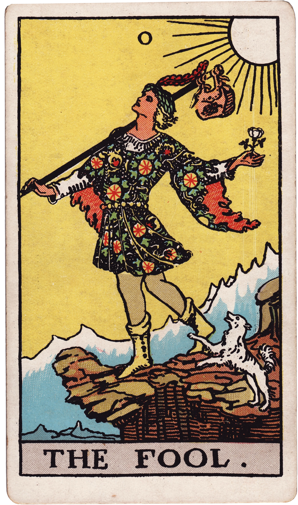 The Fool
Introduction: Why printing history matters to tarot reading
Images carry meaning, and the technologies that make images reproducible shape which details survive, which are emphasized, and how broadly an image circulates. Tarot decks are visual language systems; the way a card looks depends as much on artistic choices as on the constraints and affordances of the printing technique used. When a reader looks at The Fool, the gestures, colors, and linework they see are partly the result of century-specific printing processes. To read responsibly, learners should know how methods such as woodcut, engraving, chromolithography, offset, and digital printing change iconography. This article uses the supplied The Fool image and its supplied upright and reversed descriptions as an ongoing reference point to show how print decisions alter symbolic emphasis and practical interpretation.
The earliest printed tarot aesthetic: woodcuts and bold simplification
Early printed playing and tarot cards emerged in an era when relief printing — specifically woodcuts — dominated. Woodcut produces bold, simplified shapes and strong contours because artists carve away negative space; thin curving lines and delicate shading are difficult. When a card like The Fool is executed in a woodcut style, several consequences follow: figures are rendered with emphatic outlines, facial features and small accessories (like a knapsack, white rose, or small dog) may be reduced to symbolic shorthand, and backgrounds tend to flatten. Color, when applied, was often added by hand over the printed black lines, creating uneven hues. For interpretation, that visual economy matters. If you draw a woodcut-style The Fool, note that simplicity is not a lack of meaning but a compression of meaning into gesture and posture. The Fool's leap, his turned face, and the presence of a companion animal will be readable, but finer details (a folded handkerchief, subtle facial expression, or a distant sun) may be absent or implied. That absence should temper readings: instead of focusing on nuanced emotional states signaled by small details, emphasize bold themes — beginning, risk, and the gestalt of openness described in the supplied upright card text. Conversely, if you expect nuance and it's not visually supported, avoid inventing it; often, woodcut imagery pushes interpretation toward archetypal rather than psychological readings.
Engraving and etching: line, texture, and psychological subtlety
Engraving and etching allowed artists to render far finer lines and gradations of tone through cross-hatching and stippling. These intaglio methods made it possible to show subtle facial expressions, elaborate costume detail, and atmospheric depth. A printed The Fool produced via engraving can exhibit a more complex inner life: the face may show a hint of anxiety, clothing patterns may speak to social class or character, and shading can suggest the slope of the cliff or the texture of the ground. When interpreting such a card, the reader has permission to attend to subtle signals. The supplied upright meaning that encourages 'working with what is available now' can be read in light of texture: a carefully hatched shadow at the Fool’s feet might emphasize the real risk of the step forward, whereas pronounced highlights on the small companion animal could enhance the idea of friendly guidance. Always remember printing variability: a fine engraved line will hold up well in high-quality prints but may degrade or disappear in poorer reproductions. If a detail seems odd or inconsistent with the deck's overall quality, check whether it's a production artifact rather than intentional symbolism.
Chromolithography and the rise of color as symbolic vocabulary
Chromolithography, developed in the 19th century, made mass-color printing commercially practical. This process layered distinct color plates to produce bright, saturated imagery. For tarot, chromolithography shifted how symbolism was communicated: color ceased to be an occasional accent and became a central expressive dimension. The Fool in chromolithographic decks might feature vivid sunrises, brightly colored costumes, and a highly saturated landscape palette. Color choices here carry intentional emotional and symbolic weight — golds suggest optimism and vitality; cool blues can indicate introspection or distance. For readers: examine the palette as deliberate language. The supplied upright text centers on curiosity, openness, and beginning before every detail is known. If your version of The Fool shows a luminous, warm yellow sun printed in chromolithographic saturation, that visual cue reinforces beginnings and conscious optimism. Conversely, if a chromolithographic Fool has desaturated or muddy colors (often due to aging or poor registration), be cautious about reading pessimism into it; the visual degradation is likely technical. Chromolithography also popularized widely distributed, color-consistent decks, which led to more standardized public expectations about what a card 'should' look like.
Photomechanical reproduction and the consolidation of Rider-Waite-Smith imagery
Photomechanical reproduction in the late 19th and early 20th centuries enabled accurate, repeatable reproductions of original artwork without the labor intensity of hand engraving. One of the most consequential results for modern tarot was the ability to reproduce entire illustrated systems consistently and affordably. The Rider-Waite-Smith (RWS) tradition, in particular, benefited from these advances: Pamela Colman Smith's line work and the cards’ color plates were translated into widely distributed printed decks that established a visual standard for many readers. The Fool in the RWS iconography is especially instructive. Key elements — a small white rose, a light knapsack, a dog at the heels, a cliff edge, and a sun — are all part of a deliberate symbolic program. When photomechanical methods reproduce these elements faithfully, readers develop shared understanding about which pictorial signals support upright meanings (curiosity, beginning, action) and which support reversal themes (recklessness, avoidance). Photomechanical clarity lets readers trust small details: the white rose becomes an intentional symbol of purity and spontaneity rather than a technical accident. Thus, when the supplied upright and reversed explanations are used in readings of an RWS-fidelity Fool, details align strongly with interpretive conventions.
Offset printing, variable editions, and the democratization of variation
Offset lithography lowered the cost of high-volume printing and expanded options like spot colors, varnishes, and thicker cardstock. Offset printing increased production runs and made special finishes affordable for smaller print runs, which in turn allowed many small publishers and artists to produce decks with deliberate aesthetic choices: vintage palettes, muted inks, metallic inks, or deliberate registration shifts for an antique look. For readers, this means greater variability: two decks labeled with the same imagery could look and feel very different because of finishing choices. A Fool printed with a warm cream stock and matte varnish reads differently than the same art printed on glossy, high-contrast paper. Material qualities affect interpretation: glossy finishes intensify color and can make the Fool feel more immediate and extroverted, while matte, absorbed inks can make the same scene feel more introspective and weathered. Be attentive to such physical cues and consider them alongside the supplied upright/reversed meanings: a materially worn Fool on aged stock may encourage focusing on persistence through naivety (a nuance in the reversal text about internalized patterns), whereas a pristine, glossy Fool nudges toward positive beginnings and external action.
Digital printing, artist freedom, and the challenge of over-variation
Digital printing removed many previous technical constraints; artists can now work in any color space, include photographic textures, or combine mediums without worrying about plate setup. This creative freedom has led to an explosion of stylistic reinterpretations of The Fool: photographic montages, minimal line icons, collage treatments, or hyper-detailed paintings. The upside is diverse visual languages; the downside is that a single card name no longer guarantees a shared visual lexicon. For readers and learners, the implication is twofold. First, cultivate visual-literacy habits: identify what kind of visual language you're looking at (photorealistic, painterly, minimal, collage) and translate symbolic expectations accordingly. Second, recognize when the artist is recontextualizing traditional symbols. If your deck's Fool removes the dog or the cliff deliberately, that absence is an artistic statement, not a printing error; interpretive work then shifts to why the artist omitted or replaced those symbols. Use the supplied upright/reversed descriptions as interpretive scaffolding but be willing to map them onto new visual vocabularies rather than expecting exact correspondence.
Technique and provenance checklist for readers: reading the production clues
When The Fool appears in a reading, pause to look beyond the motif and consider production cues. A short checklist useful for any reader: - Paper and card stock: Is it matte, glossy, thick, thin, textured? Heavy, textured stock often indicates a higher-end or boutique print and may carry deliberate aging effects; thin stock could signal mass paperbacks or earlier cheap runs. - Color saturation and registration: Are colors vibrant and precisely aligned, or are there haloed misregistrations? Haloing often indicates older chromolithographic methods or intentionally 'vintage' offset printing; misregistration can obscure small symbolic details. - Line fidelity: Are lines crisp (suggesting photomechanical or digital reproduction) or coarser (woodcut/early prints)? Crisp lines support reading small symbols, while coarser lines push toward archetypal meanings. - Surface effects: foil, embossing, varnish — are these embellishments part of the symbolic vocabulary (e.g., a foil sun) or decorative afterthoughts? If a sun is foiled, the artist wants you to emphasize illumination. - Signs of handwork: hand-coloring, brush marks, or inking irregularities indicate hybrid print methods and can suggest localized emphasis that warrants attention. - Publisher/artist notes: provenance matters. Who made the deck and when? A modern artist using RWS imagery intentionally references the RWS symbolic canon; an anonymous historical woodcut situates the card within earlier folk symbolism. Use these clues to modulate your reading. If production removes micro-symbols, reduce emphasis on psychological nuance. If production highlights an element (bright sun foil, embossed dog), weight your interpretation toward that feature’s symbolic import, in conversation with the supplied upright and reversed guidance.
Common mistakes and how to avoid them
1) Mistaking production artifacts for symbolic intent. A color shift caused by age or light fading is not an intended message. Always check whether a visual anomaly is consistent across the deck or a single-card defect. 2) Applying standardized meanings without regard to visual language. The supplied upright and reversed descriptions are interpretive tools. If your deck's Fool lacks a white rose or dog by design, force-fitting traditional symbolism can do more harm than good. Instead, ask what the artist replaced or emphasized. 3) Over-reading mass-produced uniformity. A deck produced by efficient offset methods may intentionally flatten some detail for cost reasons. Don’t assume a lack of detail means lack of meaning — sometimes simplicity is deliberate; sometimes it is economical. 4) Confusing historical period with artistic style. Not every antique-styled deck is old; modern designers frequently mimic woodcut or chromolithographic aesthetics. Always verify provenance where possible. 5) Neglecting context in reversals. The supplied reversed text emphasizes distortion or internalization of The Fool's qualities. Printing methods can change which distortions are legible. A blurred or smudged face may suggest repression or avoidance only if the production context confirms intentionality; otherwise, treat it as a technical issue and interpret reversal through other visible cues.
Practical exercises: training your eye with The Fool
Exercise 1 — Comparative observation: Gather or view three versions of The Fool that differ in printing method (woodcut-like, RWS-photomechanical, and a modern digital reinterpretation). For each, note five differences in line, color, and texture. Write a one-paragraph upright reading and a one-paragraph reversed reading for each, focusing on how production influenced your emphasis. Exercise 2 — Production mapping during a reading: When you draw The Fool, take 60 seconds to run the provenance checklist (paper, registration, line fidelity, surface effects). Note which aspects of the supplied upright and reversed descriptions are reinforced or muted by production cues. During the interpretation, explicitly name one production cue for the querent (for example: 'This deck emphasizes the sun through foil, which strengthens an optimistic leaning in the card'). Exercise 3 — Symbol rescue: Choose a version of The Fool where a small traditional symbol (e.g., the white rose) is missing. Re-imagine where the artist might have relocated that symbolic function — perhaps the color scheme or a background element fulfills the same role. Write a short rationale for mapping the traditional symbol onto the new visual element.
Bringing it together: interpretation logic for historically informed readings
Interpretation should balance three streams of information: traditional symbolic vocabulary (as in the supplied upright/reversed descriptions), the artist’s visible choices, and the technical residue of the printing method. The logic looks like this: 1) Identify the core figure and action: In The Fool this is the forward step, the slight turn of the head, the companion animal, and the bundle. These are primary signifiers and carry the bulk of the archetypal meaning. 2) Check for fidelity to a known visual canon: If the deck closely reproduces RWS cues, lean on the supplied upright/reversed text as a first interpretive scaffold. Photomechanical clarity makes such alignment likely. 3) Read production cues next: Does color, line, or finish tilt the card toward optimism, danger, or interior reflection? A luminous printed sun increases emphasis on hope; rough, heavily textured printing may suggest the challenge of the Fool’s step. 4) Notice omissions and additions: If elements like the white rose or the dog are absent or replaced, interpret the replacement deliberately. Ask: what function did the original symbol serve, and where does that function appear here? 5) Synthesize into actionable guidance: Translate the reading into a practical prompt for the querent, as the supplied upright description suggests — choose the next proportionate step and work with what is available. If reversal cues appear and production suggests distortion or suppression, frame the reversal as a blockage to be explored rather than a disaster. Using this layered logic keeps interpretation grounded: you respect centuries of symbolic development while acknowledging that some signals are artifacts of how the card was made.
Conclusion: Print technology as a living part of tarot literacy
The way a tarot card looks is never purely aesthetic; it is the visible intersection of symbol, artist, and the technology that produced it. From the bold archetypal clarity of woodcuts to the color-rich declarations of chromolithography, from the standardizing power of photomechanical reproduction to the infinite permutations of digital printing, each technological stage has shaped what readers expect and how cards communicate. The Fool — with its simple but potent gestures and traditional elements — is an ideal case for practicing historically informed visual reading. By learning to spot production cues and by using the supplied upright and reversed meanings as a flexible scaffold, readers can deepen their interpretive practice and avoid common pitfalls. Ultimately, understanding printing technology helps you recognize when an image is giving you symbolic guidance and when it is merely bearing the visible traces of how it was made.
Practice questions
• When you look at the pictured The Fool, what production clues (paper, color saturation, line quality, surface finish) are most obvious?
• Which elements of The Fool (dog, knapsack, white rose, sun, cliff) are emphasized by the printing in your deck, and how does that emphasis shift the card’s upright meaning?
• If a detail is missing from your version of The Fool, what visual element seems to be carrying its symbolic function instead?
• How does the physical feel of your cards (weight, texture, finish) influence whether you interpret The Fool as an external call to action or an interior psychological shift?
• During reversal, does any printing artifact (smudging, fading, misregistration) suggest distortion or suppression, or is the reversed meaning primarily supplied by composition and color?
• How might your reading change if you discovered your deck was an early woodcut reproduction versus a modern digital reimagining?
Comments
Sign in to comment.
Continue learning
Interpreting the Dance of Justice and The Devil: Balancing Morality and Temptation in Tarot Readings
The combination of Justice and The Devil in tarot presents a profound exploration of morality, temptation, and personal accountability. This article unpacks how these cards influen...
Advanced Techniques for Combining The Moon and The Star to Enhance Intuition in Tarot Readings
This article explores advanced techniques to combine the symbolism and energy of The Moon and The Star Tarot cards to enhance intuition during Tarot readings. Drawing from traditio...
Unlocking Life Insights with the Celtic Cross Tarot Spread
This article offers a thorough exploration of the Celtic Cross Tarot Spread, focusing on its application within family and practical life contexts. Using a worked example featuring...
Unlocking Hidden Meanings with The Hermit and The Hanged Man for Spiritual Growth
This article offers an in-depth exploration of The Hermit and The Hanged Man Tarot cards focusing on their roles in spiritual growth. It guides readers through beginner and advance...
Unlocking Personal Insight with the Seven Card Horseshoe Spread
The Seven Card Horseshoe Spread is a practical and insightful Tarot layout ideal for exploring personal and family dynamics. This article breaks down each position—Past, Present, H...
Mastering the Court Cards of Wands for Unlocking Personal Drive and Leadership
The Court Cards of Wands represent a dynamic spectrum of personal energy, ambition, and leadership potential within the Minor Arcana. This article offers a comprehensive exploratio...
Tracing the Origins and Evolution of The Fool Card in Tarot History
The Fool card holds a foundational place in tarot tradition, symbolizing beginnings, openness, and the embrace of uncertainty. This article traces its origins from early European d...
Techniques for Reading Court Cards to Unlock Personality Insights
Court cards in Tarot often represent people, personality traits, or energy patterns within a situation. This article offers a structured approach for beginners and advanced readers...
Unlocking Emotional Transformation with Death and The Moon Tarot Combination
This article explores the rich and complex interaction between the Death and The Moon tarot cards within the Rider-Waite-Smith tradition, focusing on their combined potential to un...
Applying The Star Card to Foster Hope and Renewal in Personal Growth
The Star card in Tarot symbolizes hope, authenticity, and the process of steady renewal. In a single-card reading, The Star encourages embracing what is present, cultivating openne...